Click on image for closer view
2004.04.24 Urumqi, China
|
Click on image for closer view |
I've begun using a peculiar reasoning in choosing what I buy: the poorer the English, the more likely I am to purchase a particular object.
Initially this was just a matter of selecting between brands of items I came to the store intending to buy. However, the habit has now spread to picking up things which either aren't quite what I wanted or were altogether not interested in upon entering.
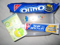
First, it was a small writing tablet. I wasn't looking for anything special, but sifted through the different options anyway. Most of them looked about the same, depicting cute drawings that might appeal to children. The notepad I wound up buying was typical of the selection, with the words Fresh Fruits above a picture of an apple and inchworm. It was the caption below that made my decision:
In moonlitht I remember your laghter and droll behavior...
Next came a tube of toothpaste. I needed a new toothbrush as well, so was already attracted to the inexpensive brand which packaged both together. I can't say for sure if it was the flavor (orange), the free toothbrush, the cheap price (2 yuan, about US $0.25), or the text which finally motivated me to buy it:
Firm Tooth
Smell Well
坚古牙齿
口味香爽
A couple nights ago I wandered into one of the small shops off-campus to buy a bottle of water. I happened upon a clone of Oreo cookies. I've seen imitations of Western products around, but this one was skillfully done. The packaging used an identical shade of blue, similar typeface, even the red triangle where Nabisco's logo should have been. The name of the knock-off is Olino, above which this mysterious description appears:
Pandemic Cookie
国内风行的饼干
Just now I've returned with my latest find: a plastic food storage tub. I was looking for a container to store the raw oats I cook up for breakfast. What I wanted was a tub with several separate compartments, so really should have chosen one of the many others on the shelf. However, I couldn't resist the sticker atop the one I did buy. It depicted a blobby creature looking much as the Michelin Man might, were he to lose all his ridges and turn blue. The left side shows him flexing his muscles while looking skyward. The middle shows him with eyes shut, blissfully contemplating the cheeseburger in front of him, a small red heart emanating from his body. It's a shame I couldn't snap a clear photo, as the expressions alone might have been enough for me to buy the tub. The text states:
Diversified blue genius offers you boundless drems and wishes. B L U E Genius
Perhaps Madison Avenue could use this technique to market products. I'm sure I'm not the only native English speaker who has bought something for its amusing description. It reminds me of an article I read in the early '90s, just as Eastern Europe was leaving the Soviet sphere of influence. At that time the Polish market was being flooded with new products from Western Europe. The article claimed that the most effective labeling was to write in slightly broken Polish. The reasoning was that Polish consumers would be pleased seeing text that actually attempted their native language, but offered them a sense of superiority, as outsiders couldn't quite master it perfectly.
It should be interesting to see what things are like here after ten years or so. The first times I traveled around this country even pinyin transliterations were scarce. The sole reason I started picking up Chinese was that it was too uncommon to find people who could speak even a little English. Most of the text seen on packaging or signs around China still doesn't have much, if any English. What Roman letters do appear are often an unhelpful pinyin transliteration of the sounds, e.g. jiān gù yá chĭ to represent the Chinese "坚古牙齿". Any text that is in English is generally the most basic description of the item, e.g. Xinjiang Beer or Education Hotel. Much of what I see has nothing but characters, though Arabic numerals now appear far more often than their Chinese equivalents.
Happily for language buffs like me, public signs in minority-populated regions are required to be bilingual. It's clear which clientele a shop caters to by the size of its text. In Urumchi this more often than not means huge Chinese characters, with tiny Uighur script above. It's obvious who patronizes a restaurant or shop where the Uighur script is actually large enough to read.
Appropriately, as I was walking back across campus this evening I crossed paths with a student wearing a T-shirt bearing huge English text. Sadly, such nonsensical English T-shirts aren't as common as they used to be. This one was a perfect example of how irrelevant the meaning was. What was cool was the English text emblazoned across the chest, not whatever the message might say. Her shirt merely said, Print T-Shirts Shop Graphic.